Take a photo of a barcode or cover
3.42 AVERAGE
3.42 AVERAGE
Classy architecture-centered 50s-era tale that me thinking of Cary Grant and Grace Kelly in the lead roles. The story is crisp with a dash of humor and the art is stylish and dashing.

I was debating 4-5 stars and decided to round up on originality alone. My hesitation was that it took me a few stops and starts to finish, which is unusual for a graphic novel I really love.
This novel, all black and white, replays some very early 1940's art style, and is super wordy. It's more a story than an action-packed thrill ride. So it reads like a book, not a comic. Is it ok for me to say that? I'm a comic fan, people. But mostly I just want to read stories about Batman and look at him while I'm doing that. I don't need 17 different shots of his fist in a villain's face, or muscles ripping through the costume. A simple frame with a word bubble will do. So this suited me just fine.
I got the sense, from the well-crafted mystery and the afterward, that the authors worked really hard for authenticity here. I applaud that. The work paid off, and really looks passionate. The Joker is just drawn so perfectly. Some of the drawings look less pro than you'd expect, but the end note says they were not retouched or erased in any way. Which is extraordinary, and deserves 5 stars for that alone. Batman without cosmetic touch-up is still awesome - I'd expect nothing less.
Plus, my husband's name is a major character in this book. My husband has a rare name and that charmed me, I will admit.
Holy blocks of text, Batman! This book was a chore to read for me. I like to read, but when it comes to comics the text should be short bursts, not giant walls covering a fourth of the page.
This is definitely not the usual superhero book. It seems like more of an experimental project in writing and art. The art is toned down. You won’t find any giant muscles or skin tight clothing. People look normal, even Batman looks normal for a guy in a costume. It does a great job of giving that retro, noir vibe but falls short on excitement and character expression.
I am all for experimentation and trying different things, especially from DC with Batman. But experiments are bound not to register with everyone and this one just didn’t strike home with me.
ARC Reviewed by Chris for Book Sake.

I really love the style of this book! And the story was pretty cool, too!
A few years ago, I made a chronology for how to read modern Batman. I was focused quite a bit on creating the order, as opposed to just reading the books for enjoyment, so now I'm going back to see how the chronology holds up.
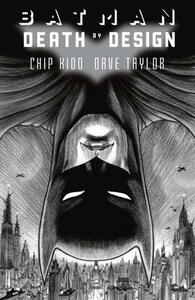
Death By Design is easily my favorite Batman book this decade. [a:Dave Taylor|54990|Dave Taylor|https://s.gr-assets.com/assets/nophoto/user/u_50x66-632230dc9882b4352d753eedf9396530.png]'s pencils and occasional colors are gorgeous. And Chip Kidd's story about murder ,journalism, and espionage surrounding the architecture and construction communities in Gotham is the most original Batman story I've ever read.
I also very much appreciate that The Joker appears as a kind of low-level pain-in-the-ass villain who is utterly baffled by the Big Picture crimes happening around him.
I recommend this for all Batman fans, people who love architecture, anyone looking for a unique art style for a Batman book, snobs who don't usually read superhero comics, and people interested in learning how to properly draw how light falls on actual people.
I thought this was awesome. I found myself reading through this so fast because I couldn't get enough. I had to reread it a few times because the authors included so much detail in every page.
fast-paced
Loved the art...and the overall story. There were some pages however where the characters had bored looking faces and the dialogue was supah-lame. Meh. for words. 3 stars are mainly for the art.
I won an arc of this comic on goodreads giveaway. the artwork was interesting and had a good story line except the parts with the joker didn't seem to quite fit in.
This isn’t your typical Batman story; it takes place when he’s just starting out and reads way more as a detective case. The story is nice and noirish with a solid plot thread running thru every scene, even the ones that don’t make sense at the time.
The art is different, but pretty. It peeved me some that Taylor draws Bruce Wayne slightly differently in every panel, but the (mostly) black and white sketch style fits the story and overall feeling of the story perfectly.
The art is different, but pretty. It peeved me some that Taylor draws Bruce Wayne slightly differently in every panel, but the (mostly) black and white sketch style fits the story and overall feeling of the story perfectly.